Soleil Rouge
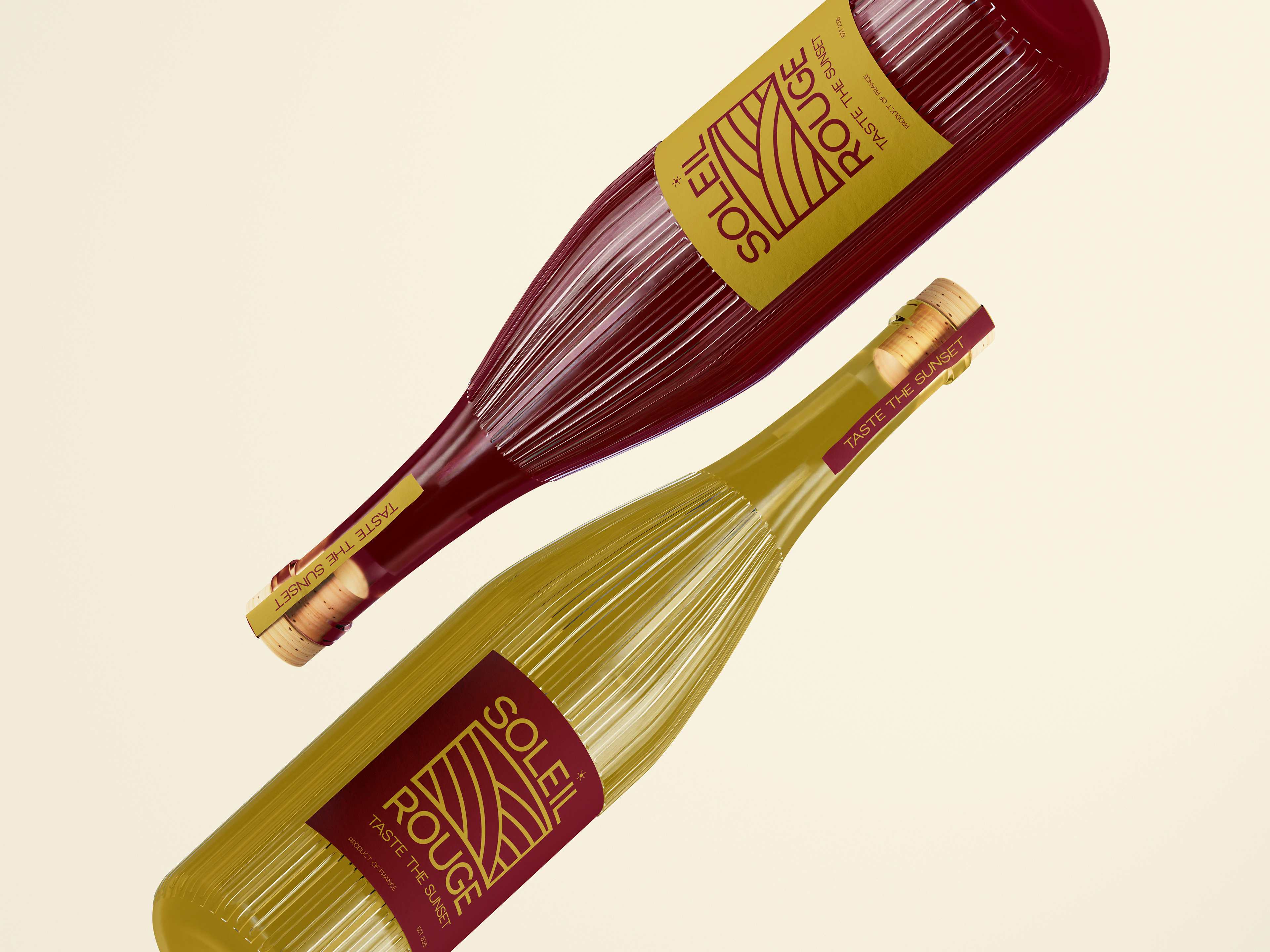
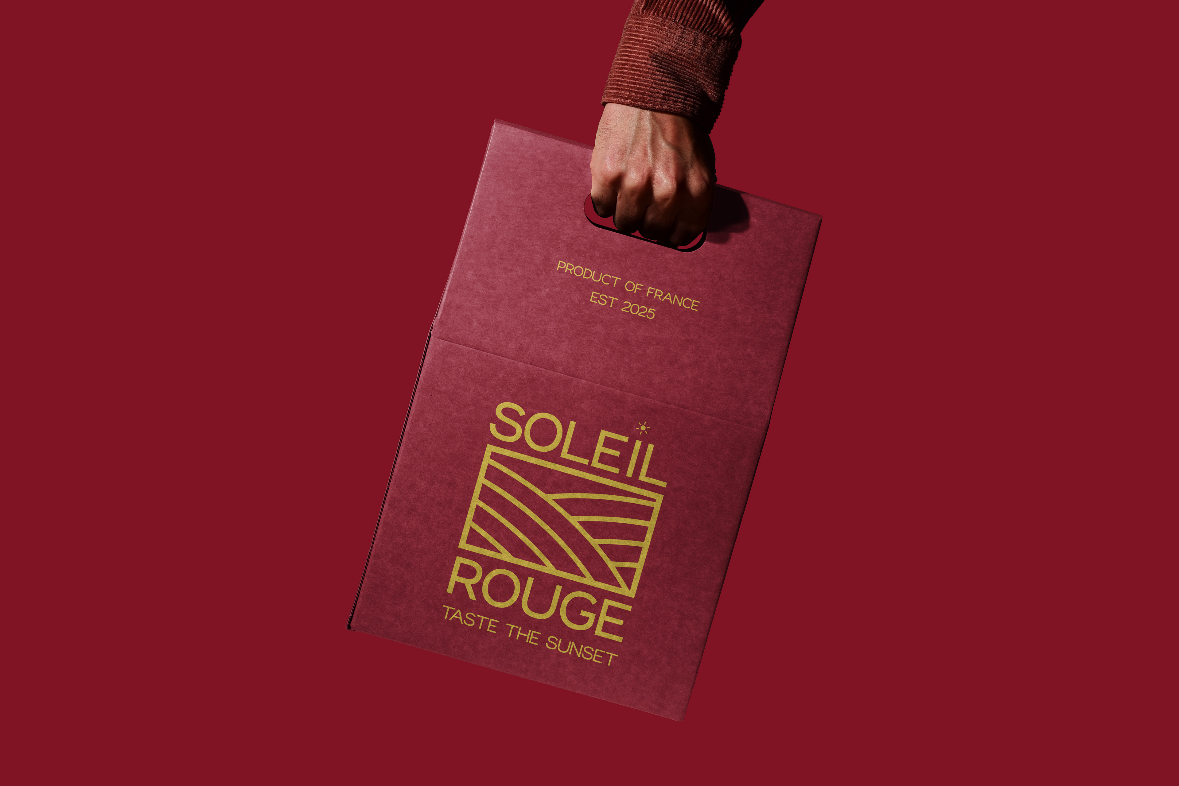
Soleil Rouge is a refined wine brand rooted in the rich tradition of French vineyards. This reimagined identity focuses on capturing the serene beauty of the countryside and the warmth of the setting sun—expressed through clean lines, a vineyard-inspired icon, and a modern sans serif typeface.
Design Challenges:
The challenge was to create a premium wine brand that highlights the essence of French vineyards without leaning on traditional or cliché design tropes. The brand needed to feel modern, clean, and upscale—appealing to a sophisticated audience while standing out on shelves.
The challenge was to create a premium wine brand that highlights the essence of French vineyards without leaning on traditional or cliché design tropes. The brand needed to feel modern, clean, and upscale—appealing to a sophisticated audience while standing out on shelves.
Solutions:
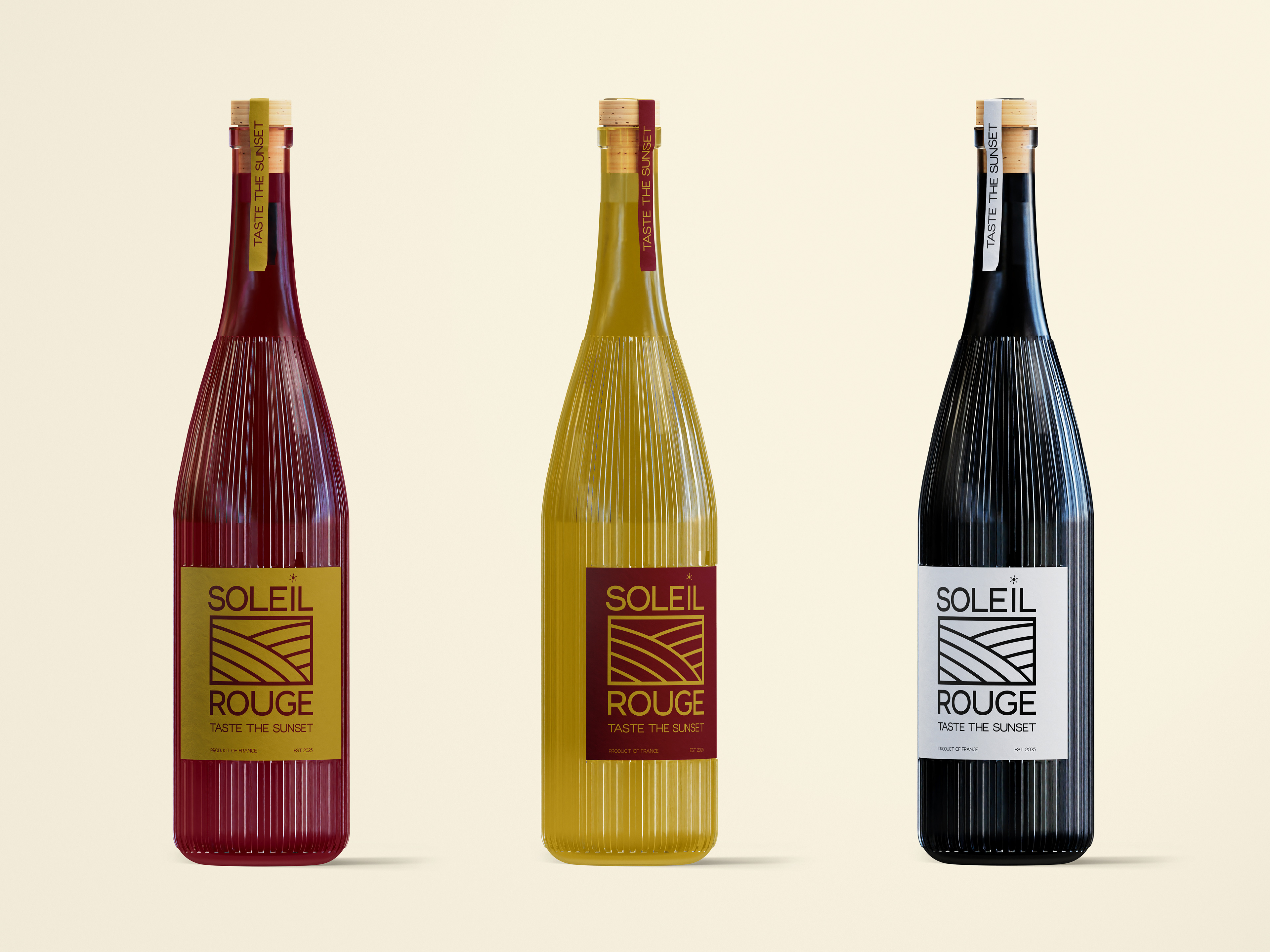
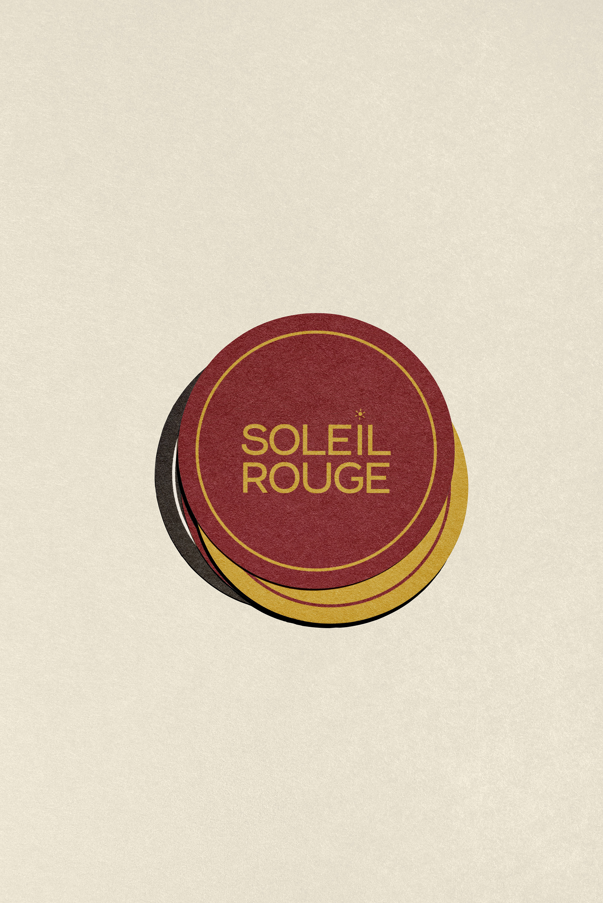
I developed a refined visual system centered around the idea of a vineyard at sunset. The logo features clean, curved lines representing vineyard rows, enclosed in a minimal frame with a subtle sun detail. I selected a sans serif typeface to give the brand a more modern, high-end feel. The deep red and gold palette captures warmth and elegance, while premium finishes like foil stamping and textured materials enhance the tactile experience.
Result:
The final identity blends modern sophistication with vineyard heritage. Soleil Rouge now presents a clean, luxurious look that communicates quality and tradition in a fresh, visually compelling way.
The final identity blends modern sophistication with vineyard heritage. Soleil Rouge now presents a clean, luxurious look that communicates quality and tradition in a fresh, visually compelling way.
