CTRL + G
The SCSU Graphic Design Student Exhibition is a curated showcase of innovative work from emerging designers, featuring projects in branding, typography, packaging, and digital design. The exhibition celebrates creativity, growth, and the collective voice of the design program.
Design Challenges:
The challenge was to create a visual identity for the event that felt energetic and student-driven, while still maintaining professionalism and clarity. It needed to unify a wide range of student projects under a single theme that felt inclusive and relevant.
The challenge was to create a visual identity for the event that felt energetic and student-driven, while still maintaining professionalism and clarity. It needed to unify a wide range of student projects under a single theme that felt inclusive and relevant.
Solutions:
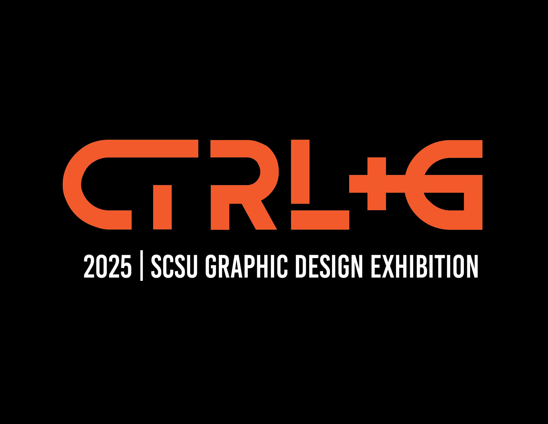
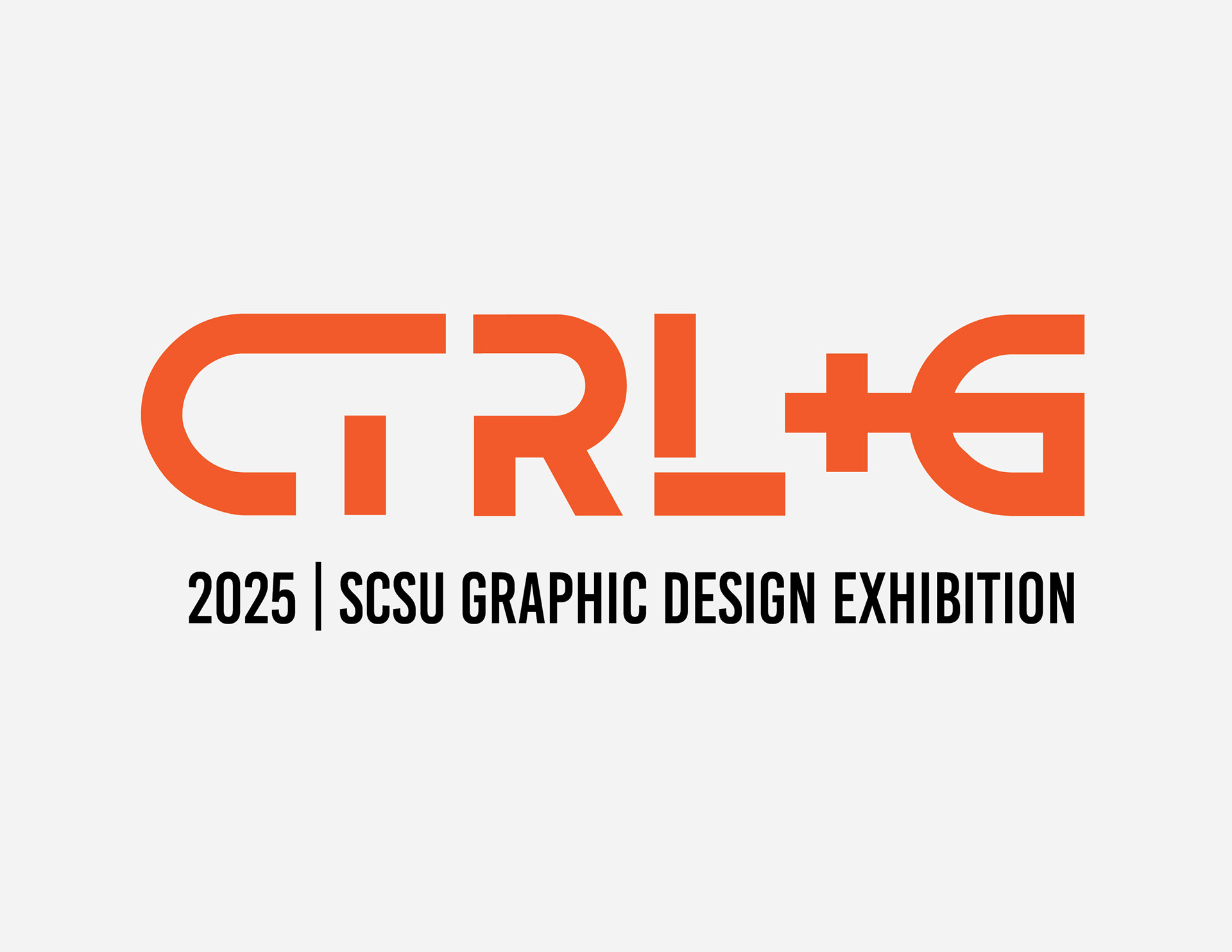
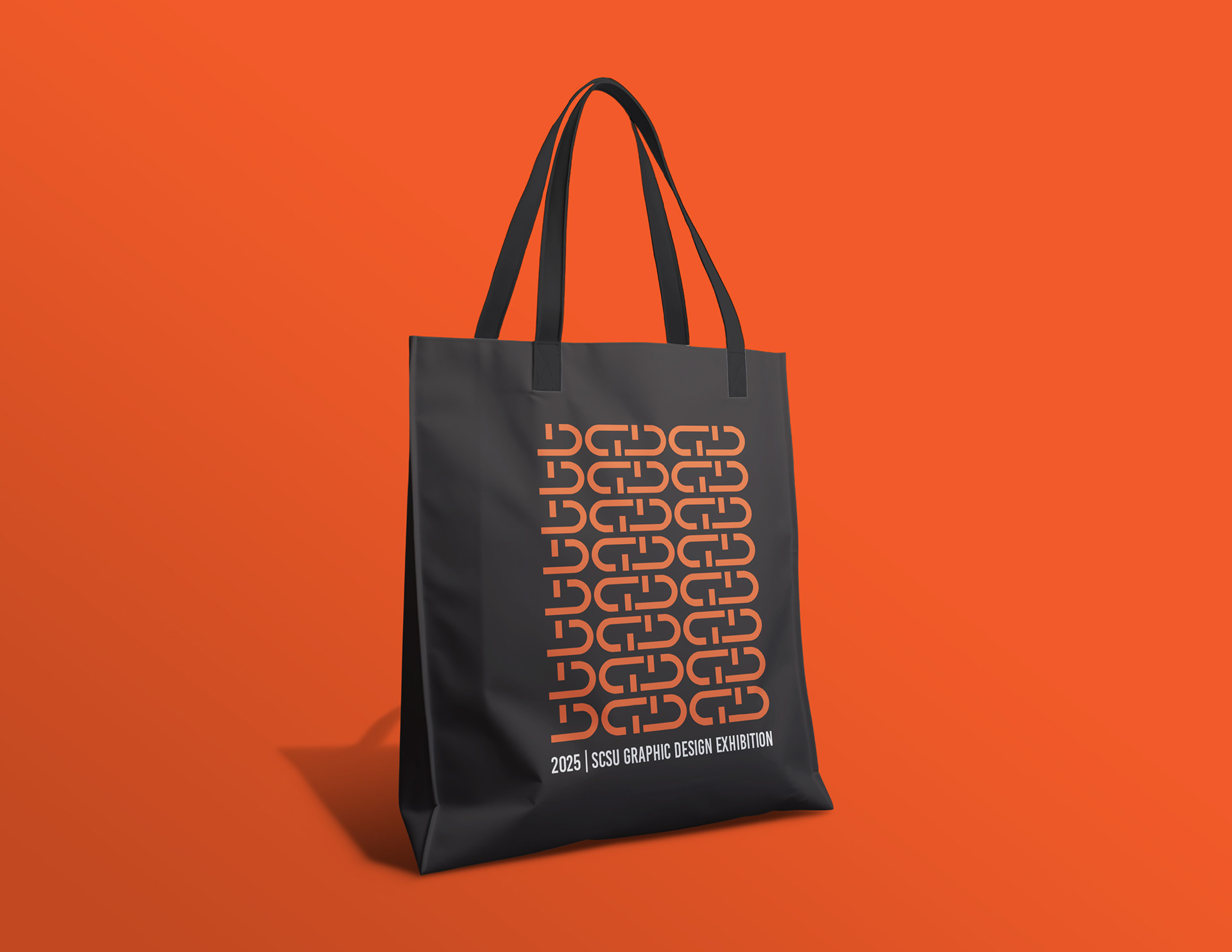
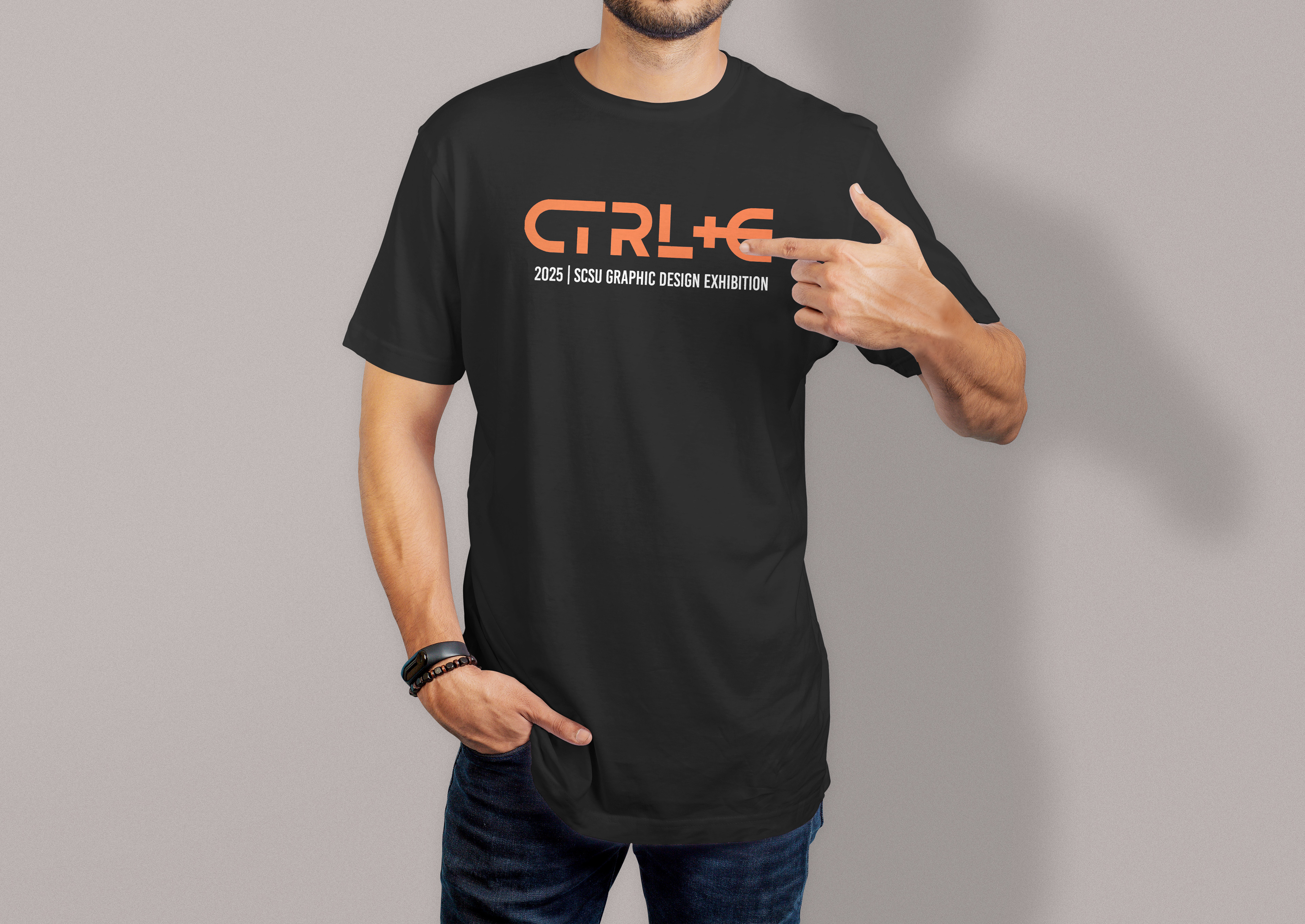
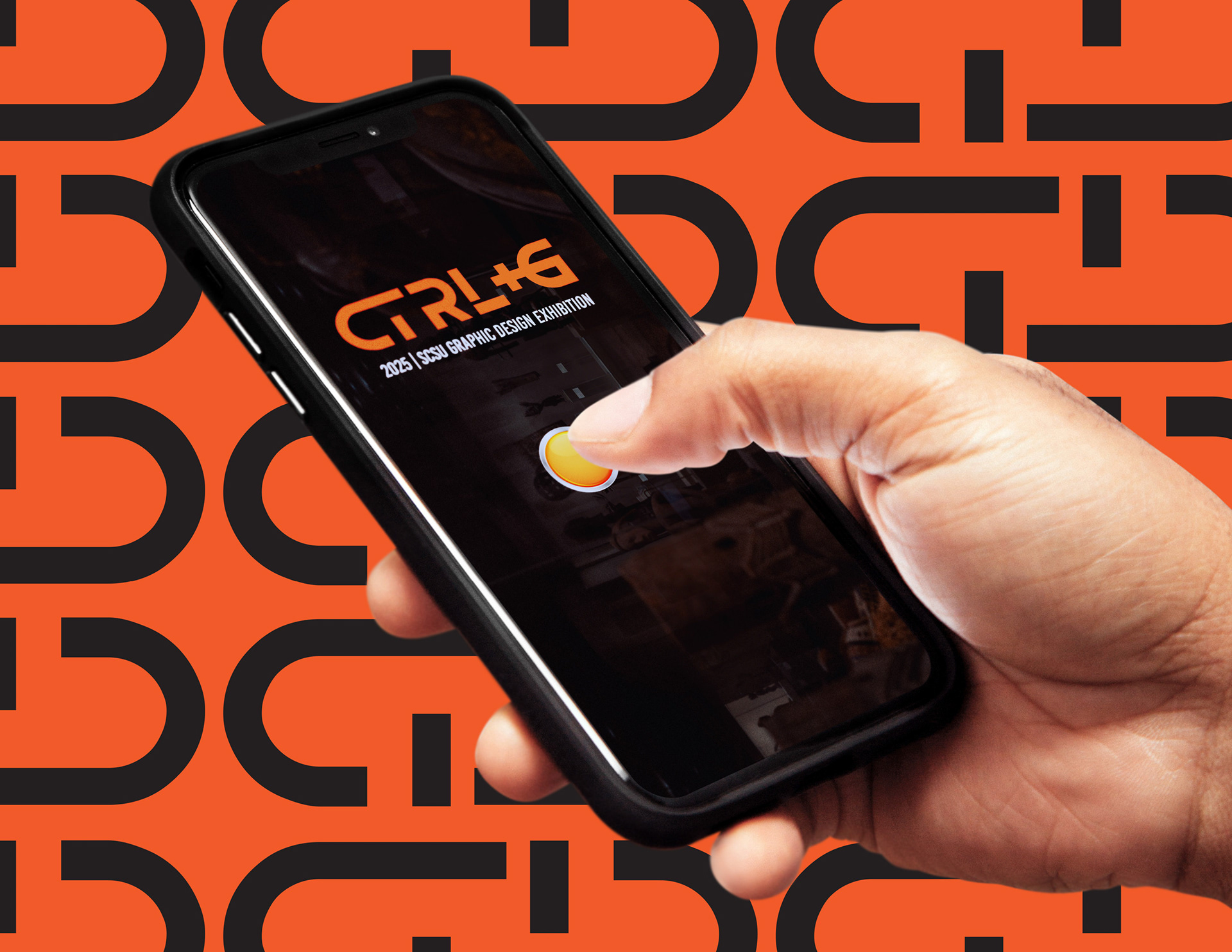
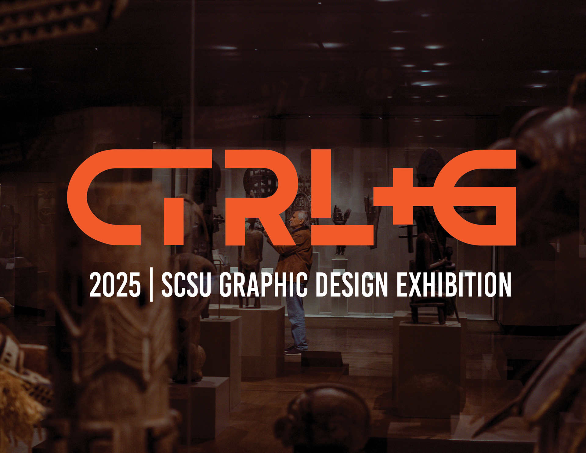
I developed the exhibition’s logo and identity, drawing inspiration from the keyboard shortcut CTRL+G—a nod to grouping elements in design software and a metaphor for the collaboration among SCSU’s design students. The logo is bold, tech-savvy, and symbolic of unity. Supporting graphics, promotional assets, and digital materials were also created to ensure consistency across posters, social media, and event signage.
I developed the exhibition’s logo and identity, drawing inspiration from the keyboard shortcut CTRL+G—a nod to grouping elements in design software and a metaphor for the collaboration among SCSU’s design students. The logo is bold, tech-savvy, and symbolic of unity. Supporting graphics, promotional assets, and digital materials were also created to ensure consistency across posters, social media, and event signage.
Result:
The final branding brought energy and cohesion to the event, capturing the innovative spirit of the students while reinforcing the program’s identity. The CTRL+G concept resonated with both participants and viewers, successfully framing the exhibition as a collective celebration of design talent.
The final branding brought energy and cohesion to the event, capturing the innovative spirit of the students while reinforcing the program’s identity. The CTRL+G concept resonated with both participants and viewers, successfully framing the exhibition as a collective celebration of design talent.